What it looks like
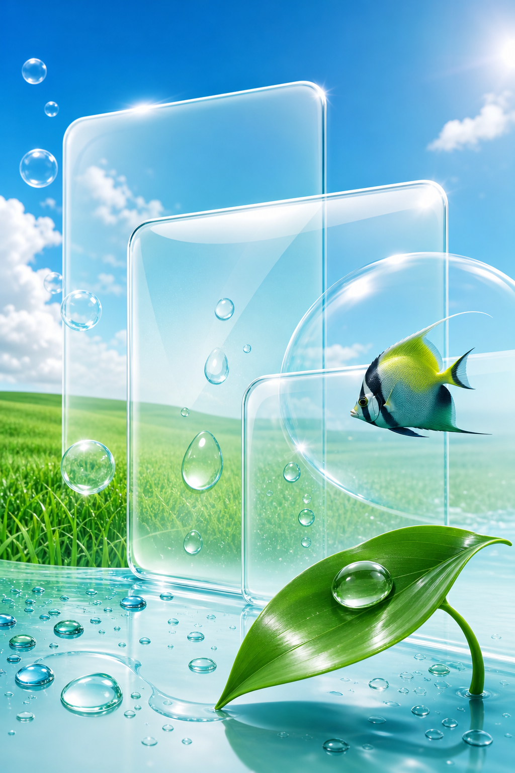
Technology presented as nature — gloss, water, grass, fish and blue sky, applied to software and to the plastic it ran on.
- Period
- roughly 2004 to 2013; named in 2017
- Power
- broadband, the social web, and software that wanted to be liked
- Materials
- frosted glass, glossy white and piano-black plastic, water, leaves
- Palette
- aqua, lime, glossy white, sky blue
- Places
- desktop wallpapers, telecom adverts, airport lounges, living rooms
The tank in the first photograph holds several hundred cubic metres of water behind a single acrylic panel, and the people are there to look at it. Put that arrangement on a desk and you have the decade.
It was named by one person, four years after it ended
The term was coined in 2017 by Sofi Lee, through the Consumer Aesthetics Research Institute. The name is a compound of two things: the Frutiger typeface, designed by Adrian Frutiger, and Windows Aero, the glass interface Microsoft shipped with Vista in 2007.
While the style was actually happening, from about 2004 to 2013, it had no name at all. Critics writing about its web version called it the Web 2.0 style, which is a description of a moment.
So a decade of visual culture went unnamed until four years after it stopped. And the name it eventually got is the only one in this family taken from a typeface.
The handover from Y2K Futurism
The two styles are consecutive chapters, and the difference between them is a single decision about what to show you.
Y2K Futurism · 1997–2004
Translucent shells, chrome, blobby forms. The case is see-through. You are meant to look at the machine.
Frutiger Aero · 2004–2013
Glossy white and piano-black surfaces, frosted glass interfaces, a photograph of a meadow behind your icons. The case is sealed and shiny. You are meant to forget there is a machine.
The Wii, released in 2006, sits exactly on the hinge: a sealed white slab with no visible working parts, whose menu screen was a grid of soft rounded tiles on a pale blue gradient.
The pictures were bought
The material of this aesthetic is stock photography, licensed by the thousand: water droplets on leaves, tropical fish, bubbles, grass under a blue sky, cupped hands, a single green shoot.
The ancestor of the whole habit shipped in 2001. The default wallpaper of Windows XP was a photograph of a hillside in Sonoma County, California, taken by Charles O'Rear in 1996 and licensed through a picture agency. A real slope on a real morning, reproduced on hundreds of millions of screens. Vista, six years later, took the same instinct and added the gloss.
So the nature here is purchased nature — retouched, saturated, and used to sell a licence. Which makes the dew photograph above a curious object: it is the real version of a thing that was usually bought.
And the office facade is the same move at building scale. Put the sky on the outside and the building disappears.
Why it worked, and why it dated
The promise was legibility and calm. Rounded corners, soft shadows, a droplet of water, a leaf — a visual argument that the software was safe, clean and on your side, at the exact moment that software was beginning to collect everything about you.
Nothing here has an adversary. There is no grit, no wear, no politics, no cost.
That is why it aged faster than anything else in this family. By about 2013 the gloss was gone: flat design arrived, the gradients were stripped out, and the same companies started presenting themselves as plain, neutral and matter-of-fact.
The three questions
The operating system, and the broadband line underneath it.
The software company, and whoever designs the interface.
Nobody; the entire proposition was that nothing needed fighting.
An aesthetic of reassurance, produced by the industry it was reassuring you about.
Why it is back
The revival is running now, and it is driven by people who were children between 2004 and 2013.
This is the same delay that produced Y2K Futurism's revival, one generation later. A decade of your own childhood becomes an aesthetic at the moment you are old enough to miss it — and what is being missed is the promise attached to it, that everything was going to be clean and green and easy.
A decade that put a photograph of a meadow over the machine, and meant it kindly.