AI-GEN
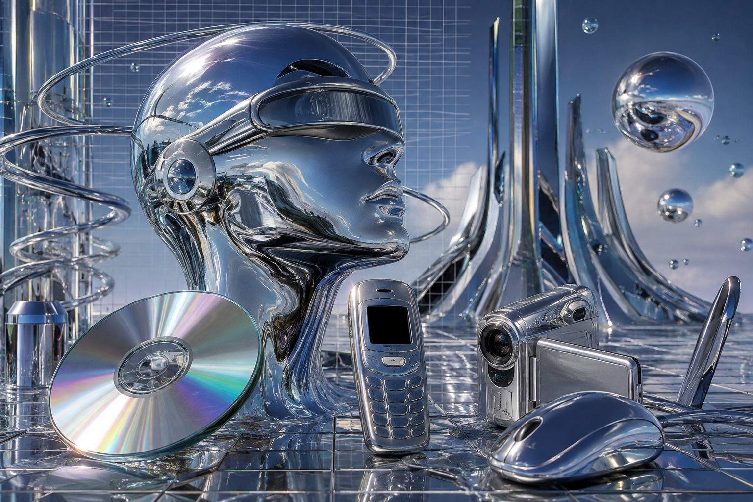
A visual essay
Y2KFuturism
The same four letters meant fear, then optimism, then longing.
A visual essay
The same four letters meant fear, then optimism, then longing.
The last time the future was something you could hold — translucent, rounded, and available in five colours.
iMac G3, Flower Power and Blue Dalmatian, 2001. CC BY-SA 3.0.
Apple iBook G3, blueberry, 1999. CC BY-SA 4.0.
The whole idea is visible in one decision. Computers had been beige boxes that hid their insides, and then for about six years they were transparent and came in colours, and the transparency was the selling point. You were meant to see that there was a machine in there.
The proper name for this is Y2K Futurism, and the extra word is doing real work.
In the 2020s, social media widened "Y2K" until it covered every trend of the early 2000s at once. Under that umbrella sits McBling, roughly 2000 to 2008 — rhinestones, chrome accessories, tabloid celebrity, a visual language with almost nothing in common with the translucent, blobby one. Y2K also now covers the fashion of the period, which is what most image searches return.
So the aesthetics community coined a longer name to pull the original meaning back out of the expanded one. Y2K Futurism, sometimes Cyber Y2K, refers only to the techno-optimist strand: chrome surfaces, blobby shapes, abstract liquid-metal graphics, and the buildings that came out of the same idea.
Across this whole family of words, the usual story is a name that gets taken somewhere its coiner never intended. This is the one case where a community fought back and made a longer name to defend the original.
Selfridges Building, Birmingham. Future Systems, 2003. CC BY-SA 4.0.
The shape language of the era had a name in architecture: blobitecture. Curved shells, no straight edges, surfaces treated as skin.
The Selfridges store in Birmingham, finished in 2003, is the clearest built example — a sagging curved volume clad in fifteen thousand anodised aluminium discs, joined to the rest of the city by a tube. It is a shop.
Every aesthetic in this family that reaches architecture ends up somewhere ordinary. Googie's future arrived and became a coffee shop. This one arrived and became a branch of Selfridges.
Will Y2K Snarl Global Transportation? United States Senate hearing, 106th Congress, 1999. Public domain.
Before it named a look, Y2K named a defect: the possibility that computers storing years as two digits would read 2000 as 1900 and fail. Through 1998 and 1999 it was a global remediation programme and a public panic — stockpiling, contingency plans, and a great deal of legislative attention.
The document here is a United States Senate hearing from 1999. The title is a question about whether global transportation was about to stop working.
So the four letters begin in fear. Then, at exactly the same time, the same four letters were being attached to translucent plastic and liquid chrome, and they meant the opposite thing: the future is arriving and it is going to be fun.
Fear and optimism, running concurrently, under one abbreviation.
Motorola RAZR V3, pink, 2004. CC BY-SA 4.0.
The third turn is the one happening now. Say Y2K in 2026 and it mostly means a revival: low-rise everything, tinted lenses, flip phones, chrome and pink.
The RAZR is the object at the centre of that revival, and it is instructive to put it beside the iBook at the top of the page. They are five years apart. One is translucent, rounded, and shows you its interior. The other is opaque, thin, chrome, and sold as jewellery. One wants to look like the future; the other wants to look expensive.
Both are now filed under the same four letters.
An aesthetic entirely about buying things, which is why it has no politics and no villain.
Every aesthetic in this module was named after the fact, by the people who had grown up inside it.
The look ran from 1997 to 2004. The name arrived in the 2010s. That gap is how long it takes for the children who used these machines to reach the age where they start naming things.
Its successor works the same way. Frutiger Aero, the glossy era of roughly 2004 to 2013, was named in 2017, by one person, through a research institute for consumer aesthetics. While it was happening it had no name at all; critics just called it the Web 2.0 style.
A decade of your own childhood becomes an aesthetic at the moment you are old enough to miss it.
For about six years the future was transparent, and you could see the machine inside it.